Thanks to remember when choosing fonts
Typography is the soul of any design & choosing the right font is very stressful. Some people are using predefined configurations for their design project, but some innovative used to spend many hours. The surprising part is there are 1000+ fonts available for use. Select the matched fonts for your design because the fonts can make your design awesome or awful.
There are two types of fonts that you can choose to create images, bio, resume, or any others. One of is standard fonts, in which you need to install font on your computer and useful to create images for your business or personal use. The problem on this is that, you need to install on your computer and it will work on your own computer only. And you can use to create DP images, Banner images, or other kind of images or resume.
While, Fancy fonts are useful for creativity or like fancy. You can use these types of fonts on social media. You can use to chat with someone as you can copy paste fonts. You can also use to create Instagram Bio or other social media bio section.

Things to Remember When Choosing Fonts –
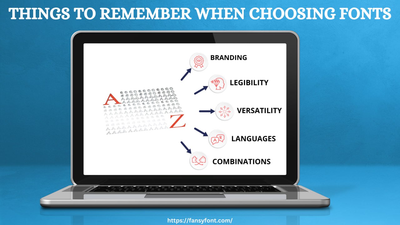
When working on digital work, fonts should be your best friend because excellent fonts will collect a vast audience & lead to a promising approach in the market. For example, when we scroll through the IG reels & posts, in between, some posts will attract you & push you to click on them. Similarly, IG Bio or Facebook bio fonts will impact the audience. Selecting the best fonts for designs is very difficult, but possible. Here are some points we should keep in mind while choosing fonts –
Branding –
As we all know, fonts have multiple uses. Fonts can be used to communicate minor points or to explain a theme or images. Every brand has its vision & music, or message. So, it is essential to select the matched fonts & it is very impactful for your audience. Write down shortlisted fonts matching the brand, and then select one explaining your brand character.
Legibility –
The fonts you are using must be legible & readable because the reader or audience will only spend a little microsecond to understand your text. This will cause a high bounce rate of your design. Also, if your plan has many readers, use fancy fonts only in titles or headlines. We want to avoid cursive fonts for your digital stuff from an understanding point of view.
Font Family –
All the fonts in the market belong to the font family & some of them belong to superfamilies. So, when you are working on a project and have time to select the font, you should know about the font family you are using because some tasks are good with two typefaces, but other requirements can be more. Most of the time, the designs are satisfied with one or two typefaces, but they rarely need different types.
Set The Limit of Fonts –
In your project, please use a maximum of two fonts because the more fonts in the design will not be eye-catching and look odd. But you can use the same fonts with different size & weight.
Versatility –
Some fonts look perfect while on digital but differently on print. Some fonts are good on high resolutions & low-resolution screens don’t fit with the same font & vice versa. It is also essential to identify if the font can perform on multiple screens and be readable in every medium.
Functionality –
You can notice that every typeface doesn’t look good in every size & weight. For example, some good-looking fonts in larger sizes will look awful in small sizes, and vice versa; some small-size fonts do not look good even in standard sizes. As a designer, you should try out your selective fonts in each size, and they should be readable & not imposing a negative impact on the users.
Languages –
It is a beneficial idea if a website can switch its language, but not all websites have the ability to switch languages. This is because not all typefaces are supported, for example, Greek. So, make sure to select the language-compatible fonts for your project.
Combinations –
When using fonts for designing, we should know that multiple types of fonts will be used to complete a design. So, there must be a combination of different fonts & only some of the fonts need to look good with others. As a designer, you should do multiple experiments to get the best font combinations.
- Art
- Causes
- Crafts
- Dance
- Drinks
- Film
- Fitness
- Food
- Jogos
- Gardening
- Health
- Início
- Literature
- Music
- Networking
- Outro
- Party
- Religion
- Shopping
- Sports
- Theater
- Wellness

